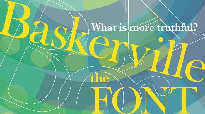
In an experiment by Errol Morris with the New York Times, the “truthfulness” of six typefaces—Baskerville, Computer Modern, Georgia, Helvetica, Comic Sans and Trebuchet was tested on 40,000 people. A quiz was given after reading an essay in each of the fonts. The conclusion was that readers were more likely to agree with a statement written in Baskerville than other fonts. Only Georgia and Helvetica were any competition at all — the others being very poorly drawn, much less readable, not intended for long texts, or all of the above.
Does this mean we should revert to the Baskerville typeface for all our promotional materials? Definitely NOT, in my opinion. Essays are only a small part of current communication needs. Trends, branding and media should factor into any typeface choices! Read the original article and see the whole story.
http://www.fastcodesign.com/3046365/errol-morris-how-typography-shapes-our-perception-of-truth


